10 of the best Adobe fonts in 2020
February 20 in Design
If you’re an Adobe Creative Cloud user, Adobe Fonts is an endlessly useful platform for finding and syncing beautiful fonts for use in any kind of design. Originally called Typekit, the service was renamed to Adobe Fonts in October 2018, and with that change came a huge amount of new fonts, no more sync limits, and more handy features.
We’ve picked out 10 of our favourite fonts to use in 2020. We’ve decided on these fonts for their excellent design, versatility and popularity based on current trends. Any one of these could be used on your next sticker or poster from Diginate! Just design your artwork and upload it when you obtain an instant quote for one of our products.
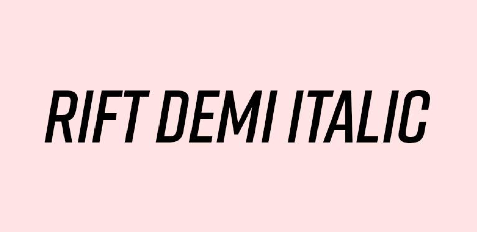
1. Rift Demi Italic
Board games are back in vogue thanks to the ever-increasing market for mindfulness, self care and offline entertainment. Rift is a font family that was created for use in the design of a board game, and was inspired by ‘the titles and lettering on campy sci-fi posters’, according to creator Mattox Shuler.
Sync Rift here.
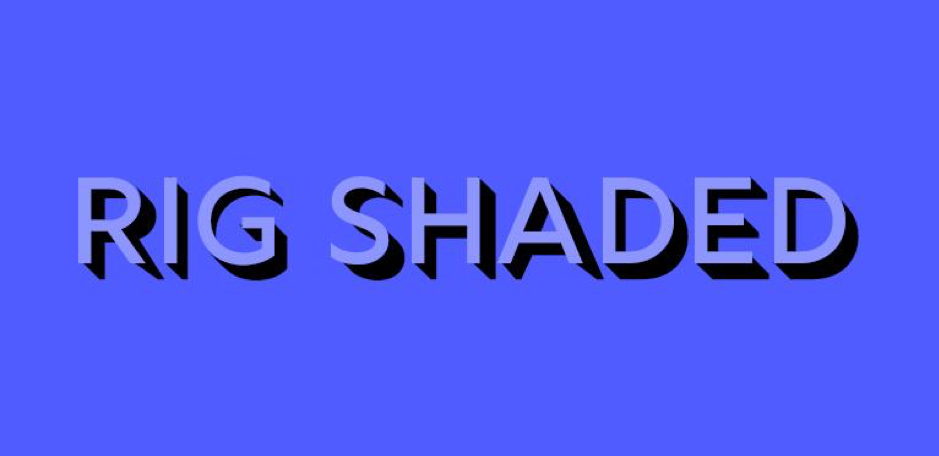 2. Rig Shaded
An award-winning font type, Rig Shaded was designed as a framework to bring brings words to life with striking 3D effects. It features four weights, each of which comprise of half-tone shading and a face font for greater control. Here, we’ve combined Rig Shaded Medium Extrude with Medium Face.
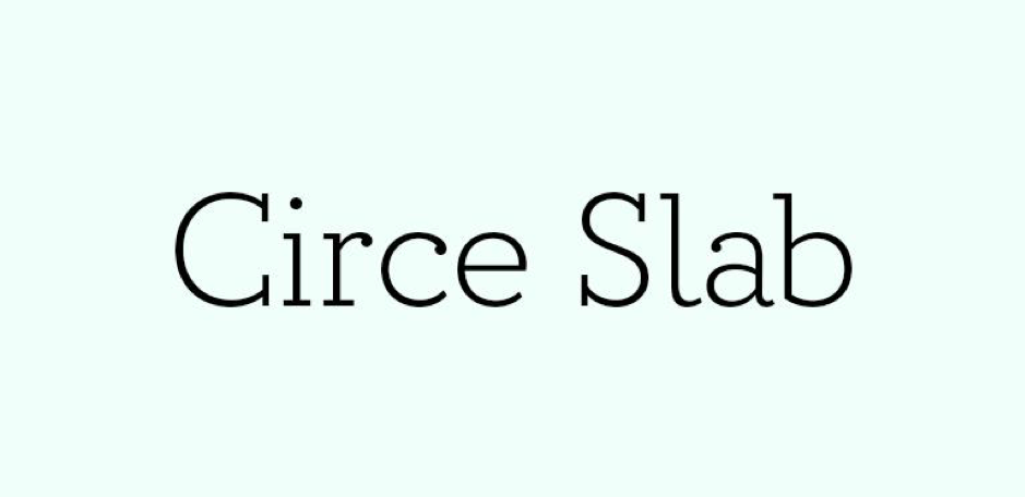 3. Circe Slab
Need a font that’s ideal for body text in its regular weights, as well as headlines and subheads in bold and light weights? Circe Slab makes for easy reading and comprises of 28 fonts in varying weights and contrasts.
Sync Circe Slab here.
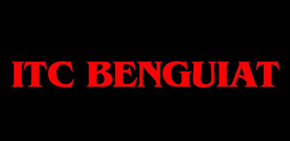 4. ITC Benguiat
As Netflix’s Stranger Things continues to feed our nostalgia for 80s sci-fi horrors, so grows the popularity of ITC Benguiat. Designed by legendary typographer and lettering artist Ed Beguiat, ITC Benguiat is part of a long line of famous fonts, including Bookman, Panache and Edwardian Script.
Sync ITC Benguiat here.
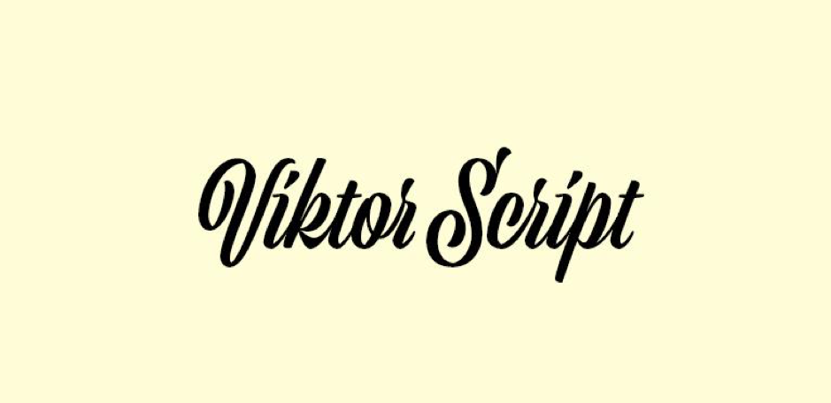 5. Viktor Script
Confident and emotive, Viktor Script was made for branding. This font would succeed in commanding attention on a large wall space, just as it would on a 40mm by 40mm sticker. Designed by Erik Marinovich in collaboration with James Edmonson of OHNO Type Co, Viktor Script is currently available in just one weight. Simple.
Sync Viktor Script here.
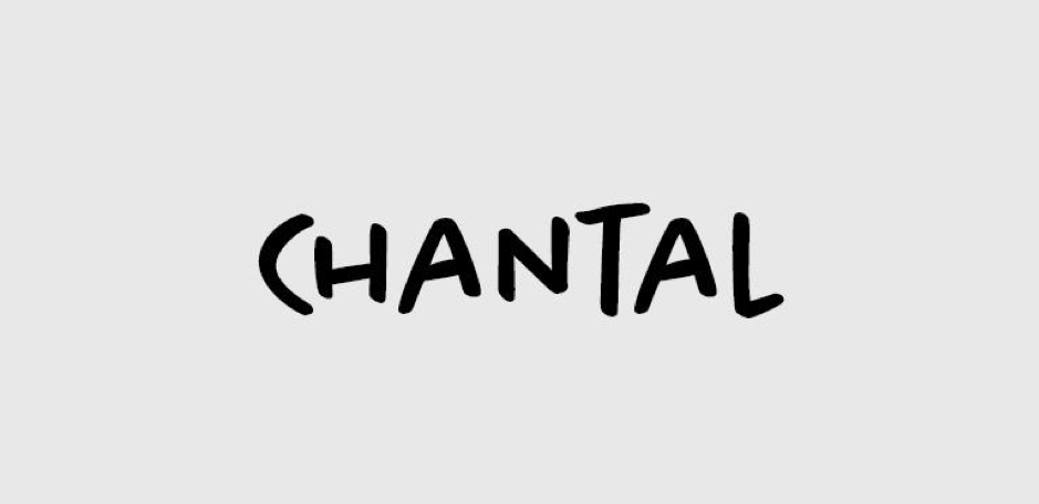 6. Chantal
Hand lettering has been popular in the font realm for a while, but it’s not going anywhere. With the increasing demand for individuality and personability from brands, hand lettering is definitely an option that should be explored when it comes to branding. Chantal is a fantastic choice, with expressive, marker pen strokes designed by Rian Hughes of Device Fonts.
Sync Chantal here.
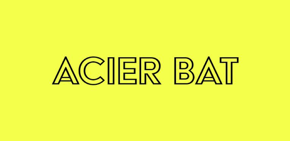 7. Acier BAT
Outline fonts are attention grabbing – great for emphasising a short message, like a brief tagline or a brand name. Sans serif fonts like Acier BAT provide a simple, modern feel without being too ‘futuristic’. This particular collection features five fonts with unique variations. Lots to play around with!
Sync Acier BAT here.
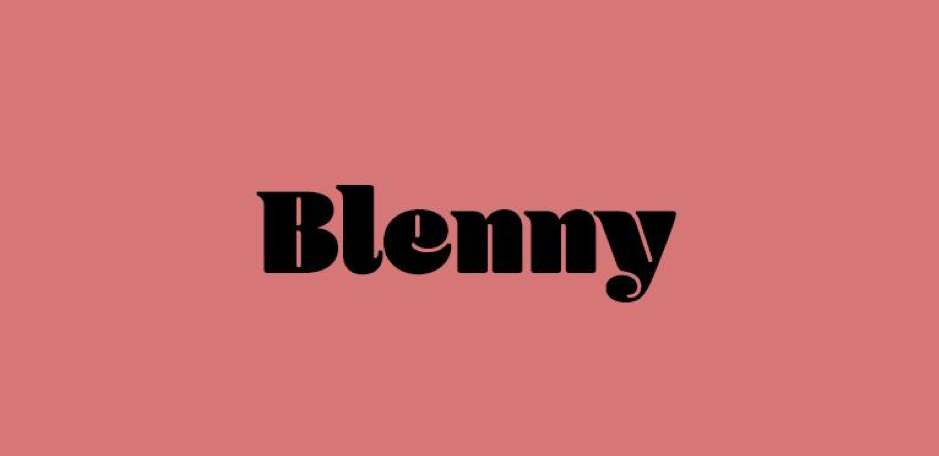 8. Blenny
Many people opt for simpler fonts to make their message easier to read for their audiences. So, if everyone else going for ‘simple’, why not opt for a font that’s more memorable? Maybe even a little retro, like Benny, with its identifiable, exaggerated ball terminals? It will definitely catch the attention of others!
Sync Blenny here.
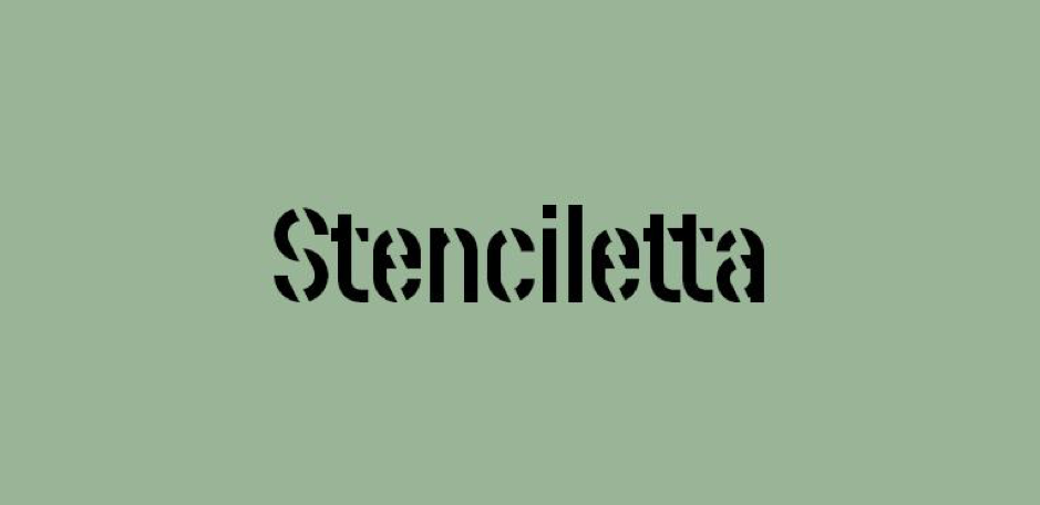 9. Stenciletta
Lots of type designers are experimenting with negative space, and seeing how far they can simplify letters while still making them readable. Stenciletta is a perfect example of this, as the font uses negative space to ‘cut through’ the letters to form a stencil effect. The font family even features right and left sides of the stencil, so that you can easily combine colours and effects.
Sync Stenciletta here.
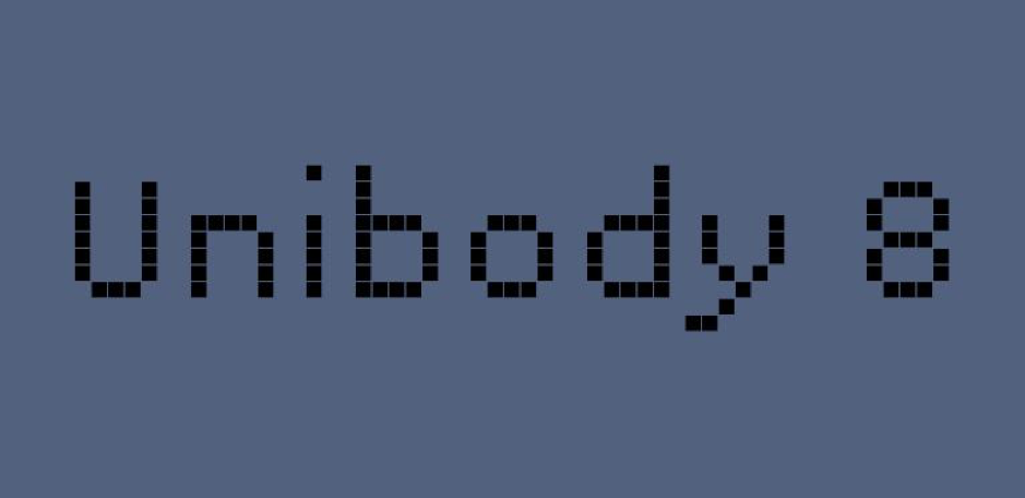 10. Unibody 8
While pixelated fonts originated from 70s computer graphics, they’re having another moment in 2020, where their use may evoke nostalgia in designs ranging from music posters to beer labels. Unibody 8 provides a handful of different weights in this pixelated style, plus a small caps version of the regular weight font.
Sync Unibody 8 here.
If you’d like to start using Adobe Fonts but don’t know where to start this video provides a great introduction:
You can also learn more about Adobe Fonts on wikipedia.
Want to use one of these fonts in a sticker or poster? Find out more about on Diginate.com.